
티스토리 뷰
- 노마드코더 클론 코딩을 통하여 공부중이다.
- CSS Flexbox, Grid 공부
생각보다 CSS가 알아야할것들도많고 중요하며 구현하는데 시간도 너무 오래걸림을 알았다.
코드스테이츠에서 많이 가르쳐준게 없기에 스스로 학습을 해야한다.
열심히 배워서 팀원들에게 해가 되지 말아야겠다.
Grid
시작은 <div>6개의 항목을 감싸는 큰 컨테이너를 만들어줘야한다. => 부모컨테이너.
Grid 작업은 항상 부모컨테이너에서.
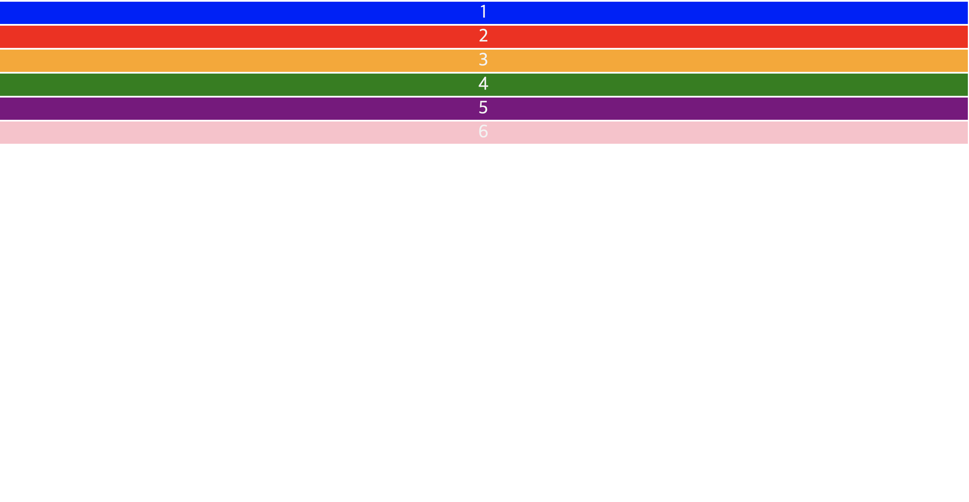
빈깡통일때?
- dispaly : grid; 와 grid-gap: 3px 만줬을때 (아주기본) => 아래 하얀색 여백이 생기며 row방향으로 정렬됨
<!DOCTYPE html>
<html lang="en">
  <head>
    <style>
      .container div {
        text-align: center;
        color: #f2f2f2;
        font-size: 2em;
      }
      .container {
        display: grid;
        grid-gap: 3px;
      }
      .container div:nth-child(1) {
        background-color: blue;
      }
      .container div:nth-child(2) {
        background-color: red;
      }
      .container div:nth-child(3) {
        background-color: orange;
      }
      .container div:nth-child(4) {
        background-color: green;
      }
      .container div:nth-child(5) {
        background-color: purple;
      }
      .container div:nth-child(6) {
        background-color: pink;
      }

      }
    </style>
    <meta charset="UTF-8" />
    <meta http-equiv="X-UA-Compatible" content="IE=edge" />
    <meta name="viewport" content="width=device-width, initial-scale=1.0" />
    <title>Document</title>
  </head>
  <div class="container">
    <div>1</div>
    <div>2</div>
    <div>3</div>
    <div>4</div>
    <div>5</div>
    <div>6</div>
  </div>
</html>
세로모양으로 나오게하려면

<!DOCTYPE html>
<html lang="en">
  <head>
    <style>
      .container div {
        text-align: center;
        color: #f2f2f2;
        font-size: 2em;
      }
      .container {
        display: grid;
        grid-template-columns: 100px 100px 100px auto auto 100px;
        grid-template-rows: 100vh;
        grid-gap: 5px;
      }
      .container div:nth-child(1) {
        background-color: blue;
      }
      .container div:nth-child(2) {
        background-color: red;
      }
      .container div:nth-child(3) {
        background-color: orange;
      }
      .container div:nth-child(4) {
        background-color: green;
      }
      .container div:nth-child(5) {
        background-color: purple;
      }
      .container div:nth-child(6) {
        background-color: pink;
      }

      }
    </style>
    <meta charset="UTF-8" />
    <meta http-equiv="X-UA-Compatible" content="IE=edge" />
    <meta name="viewport" content="width=device-width, initial-scale=1.0" />
    <title>Document</title>
  </head>
  <div class="container">
    <div>1</div>
    <div>2</div>
    <div>3</div>
    <div>4</div>
    <div>5</div>
    <div>6</div>
  </div>
</html>
- display: grid를 꼭 사용해줄것
- grid-template-colums 혹은 grid-template-rows 를 통하여 방향및 구간 설정이 가능하다. (바둑판 모양생각해주기)
그리드의 단위 1fr
Fraction : 비율!!
1fr 1fr 1fr = 1 : 1 :1 으로 생각해주면된다.
grid-template-columns: repeat(3, 1fr);
리핏: 동일하게 같은 비율로!
- grid-template-colums: reapeat(3,1fr); => 3개의 열
- grid-template-rows: repeat(2,150px) => 2개 행이 150px로
- grid-template: repeat(2,150px),(3,1fr); 위랑 똑같은 말이다. 한줄로도 가능
위와 같이 적용시 결과

<!DOCTYPE html>
<html lang="en">
  <head>
    <style>
      .container div {
        text-align: center;
        color: #f2f2f2;
        font-size: 2em;
      }
      .container {
        display: grid;
        grid-gap: 3px;
        grid-template-columns: repeat(3, 1fr);
        grid-template-rows: repeat(2, 50px)
      }
      .container div:nth-child(1) {
        background-color: blue;
      }
      .container div:nth-child(2) {
        background-color: red;
      }
      .container div:nth-child(3) {
        background-color: orange;
      }
      .container div:nth-child(4) {
        background-color: green;
      }
      .container div:nth-child(5) {
        background-color: purple;
      }
      .container div:nth-child(6) {
        background-color: pink;
      }

      }
    </style>
    <meta charset="UTF-8" />
    <meta http-equiv="X-UA-Compatible" content="IE=edge" />
    <meta name="viewport" content="width=device-width, initial-scale=1.0" />
    <title>Document</title>
  </head>
  <div class="container">
    <div>1</div>
    <div>2</div>
    <div>3</div>
    <div>4</div>
    <div>5</div>
    <div>6</div>
  </div>
</html>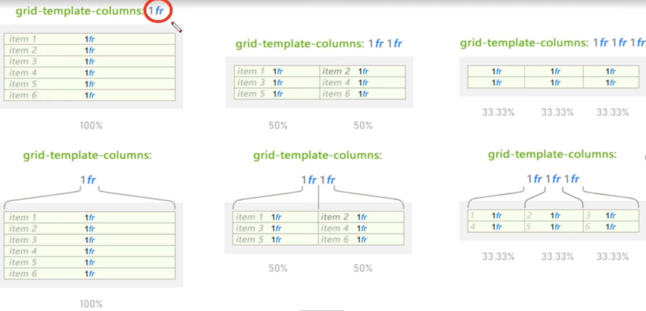
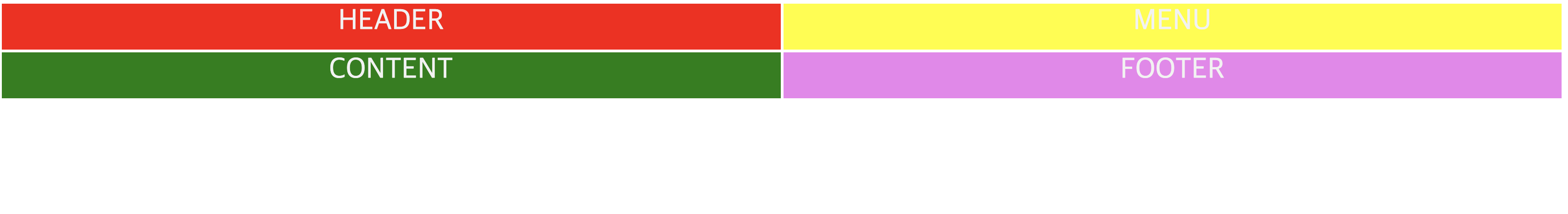
Column Line과 Row Line 이해하기

헤더를 만드려면 어떻게 사용을 해야할까?
=> 컬럼이 2개. 라인은 3개를 사용

STEP.
바둑판을 만든다.
Head가 몇번째 부터 몇번째를 사용하는지 확인한다.
<!DOCTYPE html>
<html lang="en">
  <head>
    <style>
      .container div {
        text-align: center;
        color: #f2f2f2;
        font-size: 2em;
      }
      .container {
        display: grid;
        grid-gap: 3px;
        grid-template-columns: repeat(2, 1fr);
        grid-template-rows: repeat(2, 50px);
        /* background-color: olive; */
      }
      .header {
        background-color: red;
      }

      .menu {
        background-color: yellow;
      }

      .content {
        background-color: green;
      }

      .footer {
        background-color: violet;
      }
    </style>
    <meta charset="UTF-8" />
    <meta http-equiv="X-UA-Compatible" content="IE=edge" />
    <meta name="viewport" content="width=device-width, initial-scale=1.0" />
    <title>Document</title>
  </head>
  <div class="container">
    <div class="header">HEADER</div>
    <div class="menu">MENU</div>
    <div class="content">CONTENT</div>
    <div class="footer">FOOTER</div>
  </div>
</html>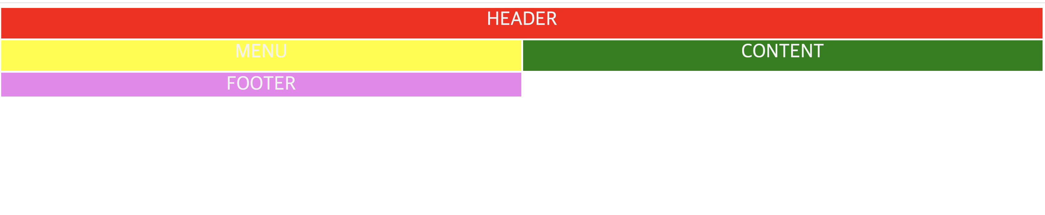
start와 end를 사용해서 사용하는 구간을 만들수있다.
  .header {
        background-color: red;
        grid-column-start: 1;
        grid-column-end: 3;
      }
footer에도 같은 속성을 줘본다면?
  .footer {
        background-color: violet;
        grid-column-start: 1;
        grid-column-end: 3;
      }
💡div는 네개를 사용했는데? 이렇게 6개로 나눠지는것 처럼 보이는 grid가 만들어지기도하는것

<!DOCTYPE html>
<html lang="en">
  <head>
    <style>
      .container div {
        text-align: center;
        color: #f2f2f2;
        font-size: 2em;
      }
      .container {
        display: grid;
        grid-gap: 3px;
        grid-template-columns: repeat(2, 1fr);
        grid-template-rows: repeat(100px auto 100x);
        /* background-color: olive; */
      }
      .header {
        background-color: red;
        grid-column-start: 1;
        grid-column-end: 3;
      }

      .menu {
        background-color: yellow;
      }

      .content {
        background-color: green;
      }

      .footer {
        background-color: violet;
        grid-column-start: 1;
        grid-column-end: 3;
      }
    </style>
    <meta charset="UTF-8" />
    <meta http-equiv="X-UA-Compatible" content="IE=edge" />
    <meta name="viewport" content="width=device-width, initial-scale=1.0" />
    <title>Document</title>
  </head>
  <div class="container">
    <div class="header">HEADER</div>
    <div class="menu">MENU</div>
    <div class="content">CONTENT</div>
    <div class="footer">FOOTER</div>
  </div>
</html>
grid-template-rows 부분을 수정했는데
변화가 없는이유??? => container가 높이를 다 사용하고있지않다. 아무론 높이값을 주지않음.
height: 100vh를 주면?
.container {
        height: 100vh;
        display: grid;
        grid-gap: 3px;
        grid-template-columns: repeat(2, 1fr);
        grid-template-rows: repeat(100px auto 100x);
        /* background-color: olive; */
      }
결과는 똑같. span으로 써도된다.
grid-column-start: 1;
grid-column-end: 3;
===
grid-colum: 1/ span 2
아래의 모양처럼 사용을 하고싶다면?? 1:4로 그럼 어디를 수정해야하나?

컨테이너 column부분을 수정한다.
     .container {
        height: 100vh;
        display: grid;
        grid-gap: 3px;
        grid-template-columns: 1fr 4fr;
        grid-template-rows: repeat(100px auto 100x);
        /* background-color: olive; */
      }
    <style>
      .container div {
        text-align: center;
        color: #f2f2f2;
        font-size: 2em;
      }
      .container {
        height: 100vh;
        display: grid;
        grid-gap: 3px;
        grid-template-columns: repeat(12, 1fr);
        grid-template-rows: repeat(100px auto 100x);
        /* background-color: olive; */
      }
      .header {
        background-color: red;
        grid-column: 1/-1;
        /* grid-colum: 1/ span 2 */
      }

      .menu {
        background-color: yellow;
        grid-column: 1/5;
      }

      .content {
        background-color: green;
        grid-column: 5/-1;
      }

      .footer {
        background-color: violet;
        grid-column: 1/13;
      }
</style>'CSS' 카테고리의 다른 글
| [CSS]li속성 정렬, 줄간격 맞추기, 단락의 두 번째 줄부터 들여 쓰기 (0) | 2022.06.22 |
|---|---|
| [CSS]position absolute - position relative (0) | 2022.01.15 |
| [CSS] Grid 레이아웃 공부2 Template areas, auto-fit, min-max (0) | 2022.01.14 |
| twittler 만들어보기(와이어프레임 설계, 구조잡기) (0) | 2021.10.21 |
| css : 기본 문법과 flexbox (0) | 2021.10.21 |